Cetec Work Order
Goal: Make people’s jobs easier by providing a simple, intuitive, and easy-to-use Work Order experience
Role: Research & Design
Timeline: 3 months
User Research | Stakeholder Collaboration | Design Strategy | UX Design | Developer Hand-off
Overview
This summer I dove into the world of manufacturing through the perspective of UX and UI design as a design intern at Cetec ERP, a software company that aims to simplify and organize complex information and workflows for manufacturers. We’re talking orders, inventory, sales, parts, labor, inspections, accounting, and more! In short, Cetec wants to be ‘the brain’ so that people have what they need at their fingertips and can do their job more effectively.
At Cetec ERP, the Work Order screen is one of the most-used pages. What’s a Work Order? Think of it like assembling furniture. You get a list of parts, step-by-step instructions, and a general idea of how long it will take.
What a furniture assembly Work Order might look like
In manufacturing, a Work Order does the same thing but at a much larger scale. It holds all the materials, steps, and labor details needed to build a product. It’s relied on daily by floorworkers, supervisors, and upper management alike.
With so many users depending on it, improving the Work Order experience was a key opportunity for thoughtful UX.
The Challenge:
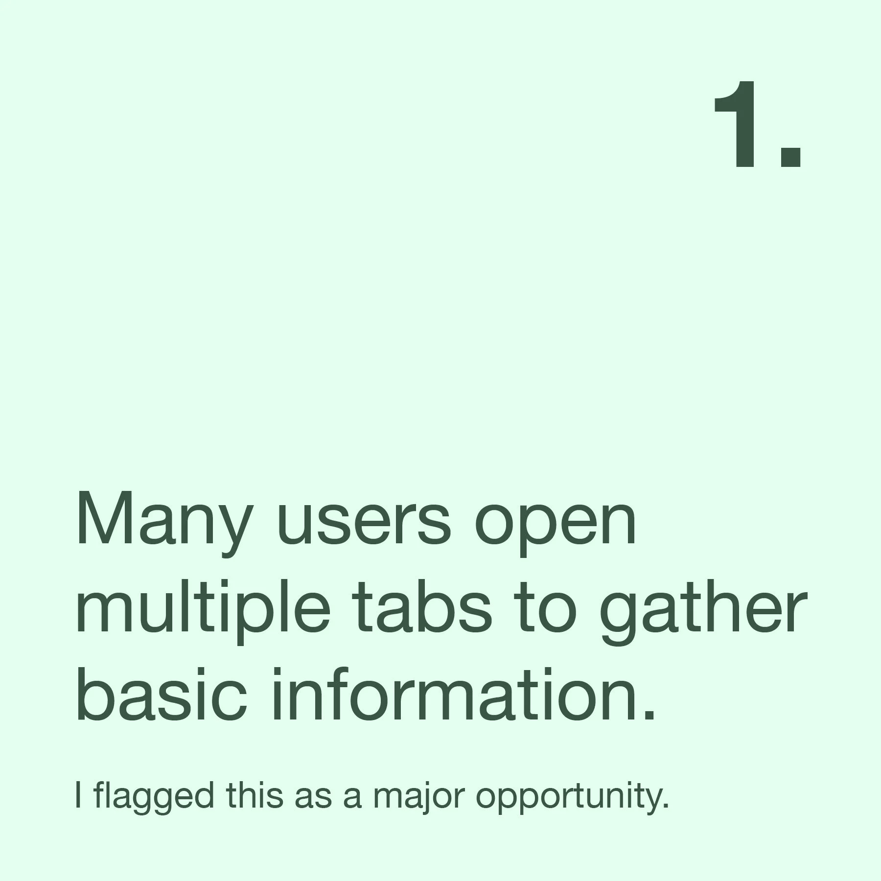
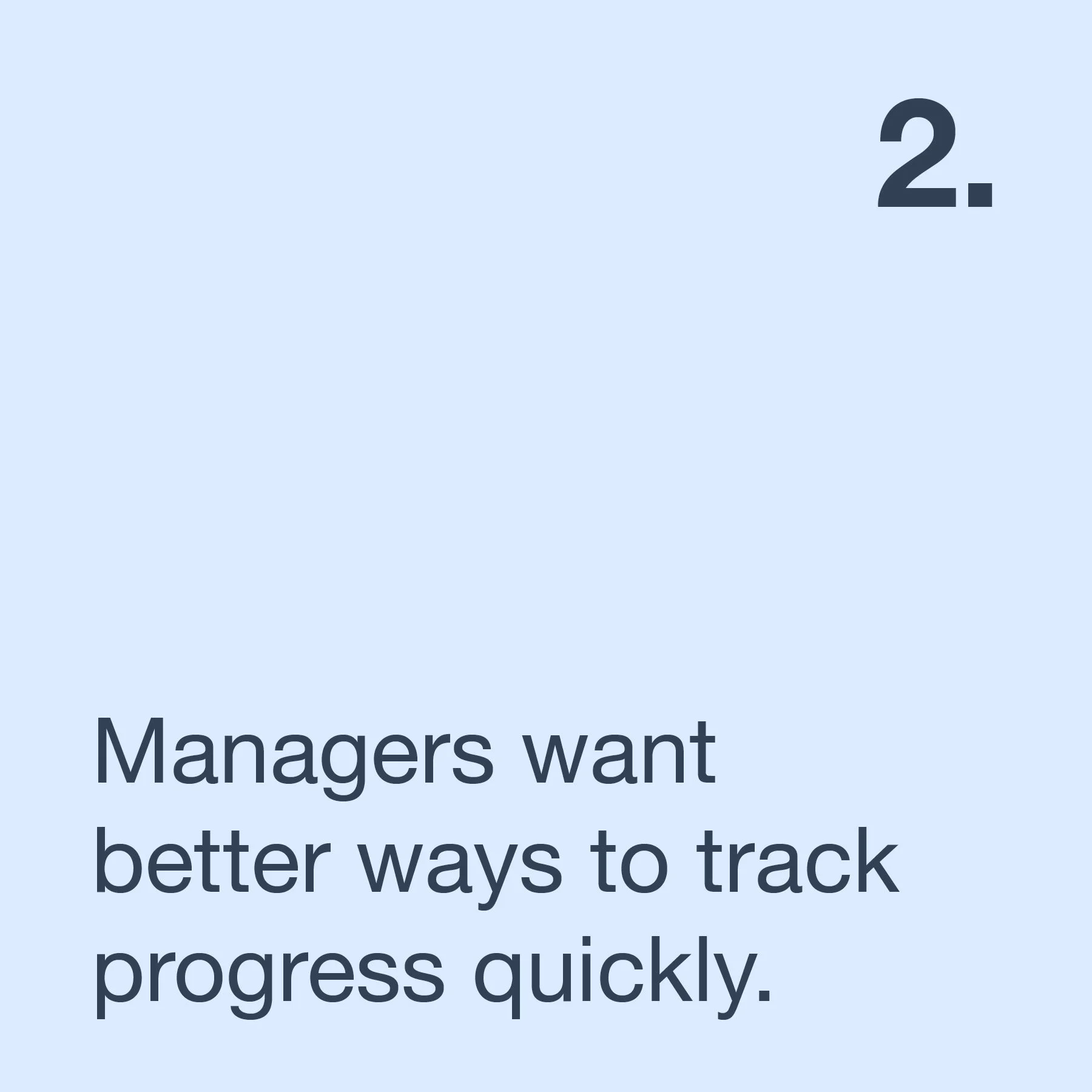
Cetec’s existing Work Order screen is functional but clunky. Users struggle to find the information they need, and the interface can feel overwhelming. Managers can’t quickly track progress or see where a part is on the floor. Floorworkers often open multiple tabs just to follow their instructions. Everyone wants the information in one place, at their fingertips.
Our goal was to make the Work Order page simpler, more intuitive, and easier to use across different roles.
My goal was to make the Work Order simple, intuitive, and easy to use.
Getting Started
My first step was learning how Cetec works, then diving into the Work Order process. I followed the Double Diamond framework, starting with discovery and assessment.
Internal Stakeholder Interviews
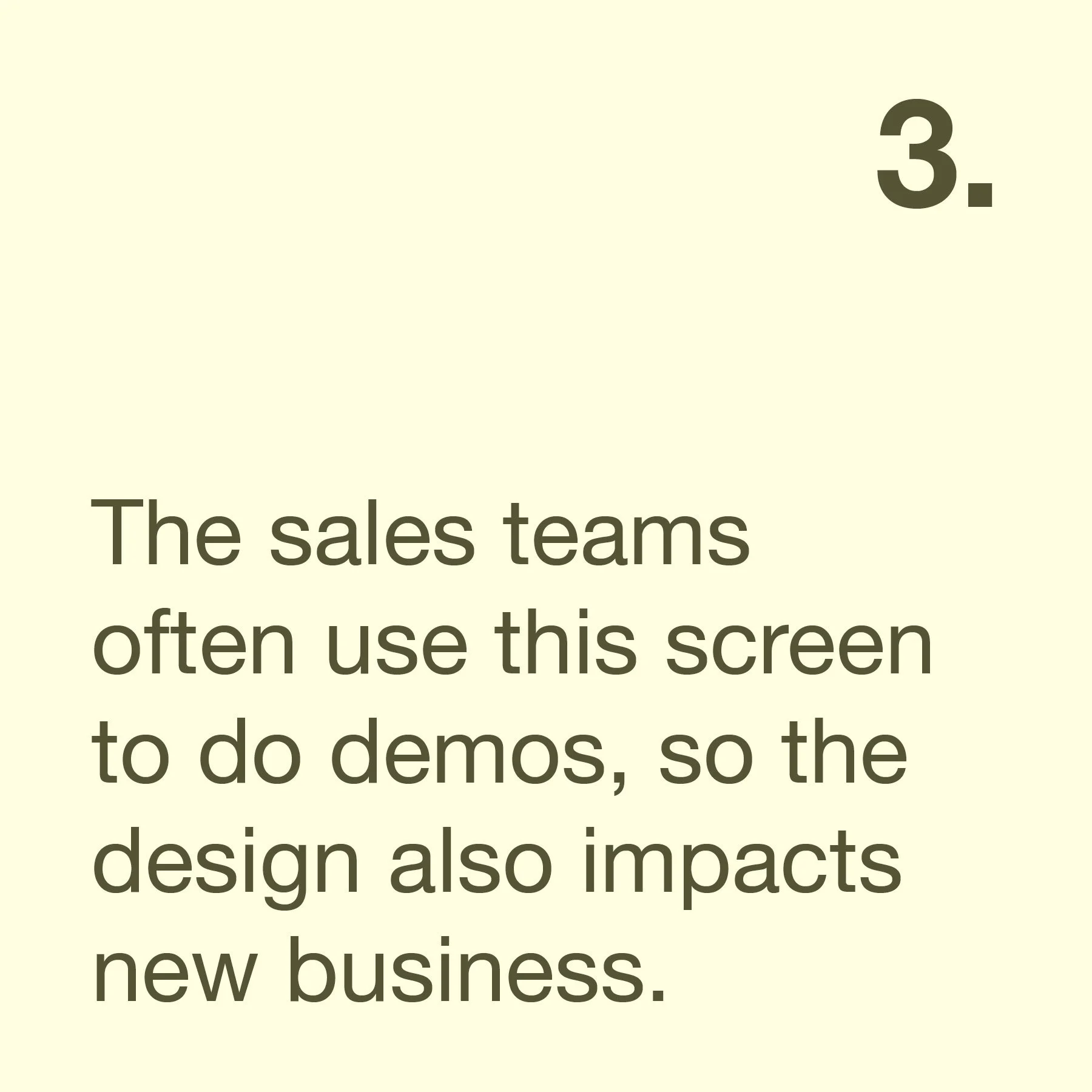
I met with people across Engineering, Sales, and Marketing to understand how the business thinks about the Work Order and what technical or strategic constraints I’d need to keep in mind.
Key Takeaways:
User Interviews
After understanding the internal perspective, I needed to hear from actual users. I created a session format that let users walk me through how they use the Work Order screen, pointing out frustrations and showing their workarounds.
I spoke with 8 users across 5 companies in industries ranging from wire harnesses to biomedical devices. One of the highlights was getting to visit a biomedical company in person to see a floorworker using Cetec in the real world.
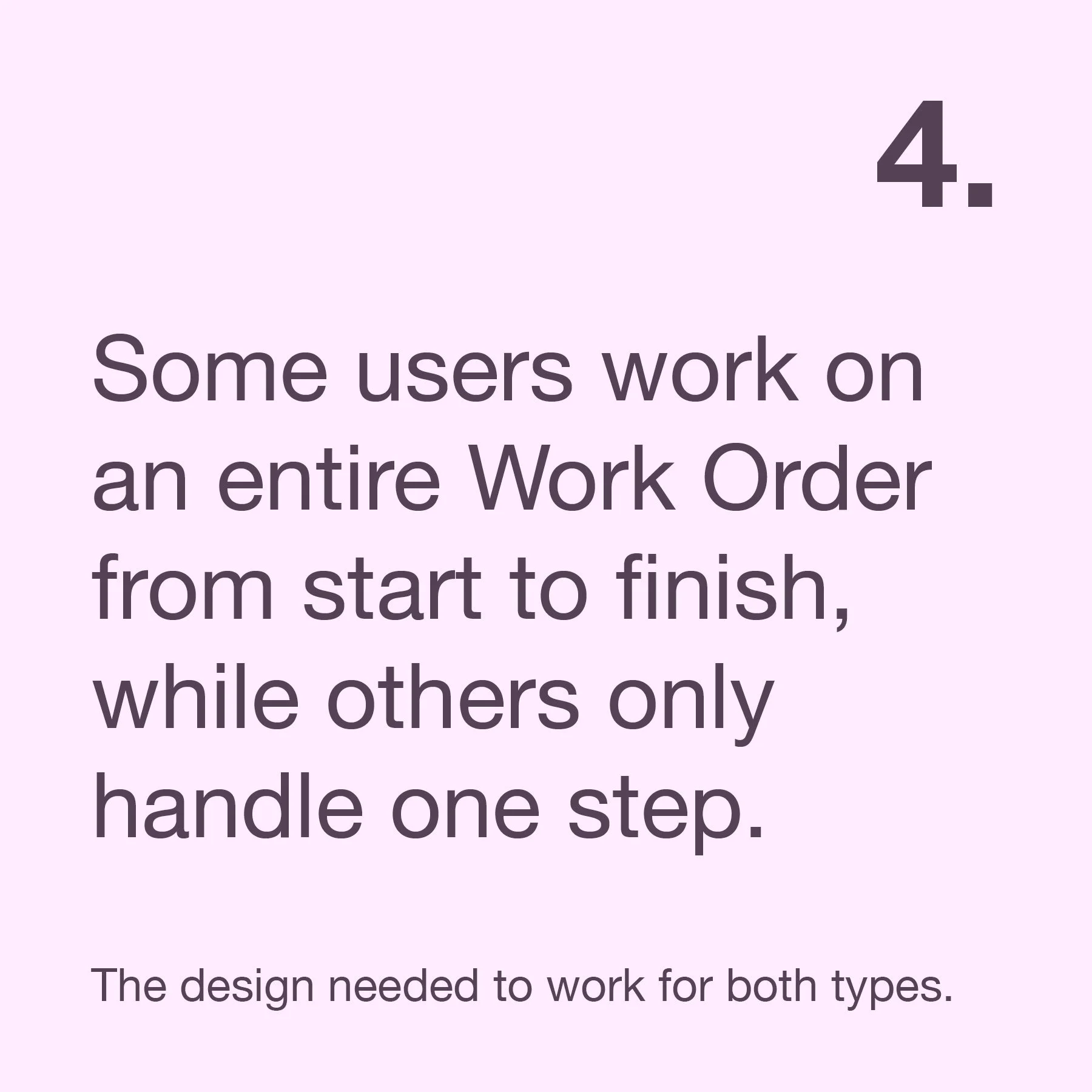
Key Takeaways:
This gave me a strong foundation for understanding real user needs, different usage scenarios, and where improvements would make the biggest impact.
Defining the Scope
With a clearer picture of the problems and user needs, it was time to narrow the focus. I discovered that many of the data-tracking features managers wanted already existed elsewhere in CETEC. After discussing this with my manager, we decided to focus this redesign on floorworker users, whose needs were more specific and consistent and use a future project to XXX.
Key areas I chose to focus on:
These improvements are aimed at floorworkers but will benefit all users because of the improved access to information and better process visibility.
Design and Iteration
With a clear scope and direction, I started sketching layout options. I intentionally pushed myself to explore different structures and layouts rather than sticking to the current system. This helped me break out of old patterns and think about what would actually serve users best.
Stakeholder Feedback
I started by sharing the designs with Cetec’s staff engineer to understand feasibility issues. He gave helpful feedback and encouraged me to think about how components behave across different states. What happens when something is in progress? What if no data has been entered yet? These conversations helped me refine the functionality and make the design more resilient.
Later, I presented to senior leadership. Their feedback pushed me to zoom out and evaluate which features were essential for the majority of users, not just specific edge cases. Sales and Marketing were especially enthusiastic about the new design direction. They encouraged me to consider even more real-world scenarios, which helped shape the next round of refinements.


