The Crow Museum
Redesign a museum website
Timeline: 6 weeks
Design Role: Design Lead, Product Research, Product Design
Design Team: Emmaline Benson, Emily M, Madalyn L, (we each conducted and shared research, and then independently designed our own solution)
Project Description: We applied the user-centered design process to iterate and improve upon an existing museum website.

Research & Ideation
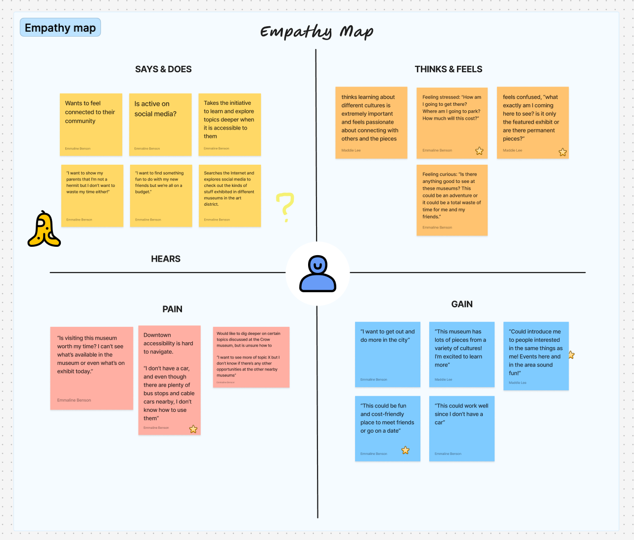
To guide our research and design process, we created user personas to represent the average Crow Museum visitor. To further expand the user personas, we created empathy maps. In an ideal world, we would have interviewed real visitors, but for the scope of the project we made do with putting ourselves in the user's shoes.
We decided to focus on three key user problems in our redesign:
“What’s on display at the museum?”
“How do I plan my visit?”
“How can I get involved?”
Once the design process started, we each took a solo approach to redesigning the homepage. As I started to sketch, I leveraged our upfront research. I wanted to identify the information that would be most important in addressing the three key user problems. For example, I wanted to clearly communicate the current exhibits and that the museum is free!
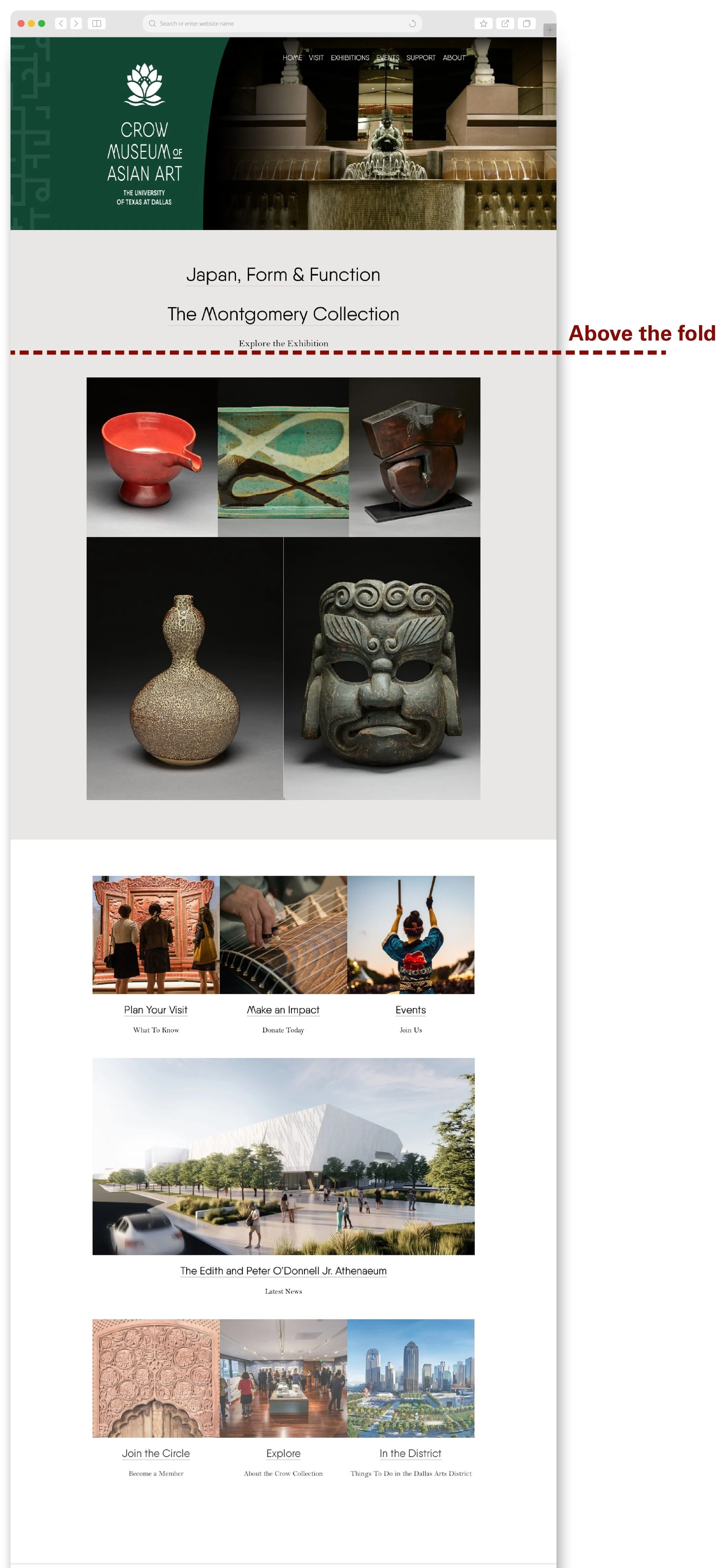
Assessing the original homepage
To start the redesign process, our team looked over the original Crow Museum website and identified issues.
We first noticed the ‘exhibition’ section that features an assortment of images but at different sizes. These images are beautiful, but the current layout feels confusing and unfocused. I found myself asking: ‘why are certain images at different sizes?’ if I’m asking this, it’s probably safe to say other users are too.
Below this section, there’s a gallery images and buttons linking to other key information aspects such as: planning your visit, donating, and events. This is important information but it’s not given an adequate amount of space on the page. Additionally, some of this information feels important to have readily accessible on the homepage, like the address and hours open. Plus, the Crow Museum has a unique selling point of having free admission. This information is not specified and feels like a missed opportunity.
The homepage scroll is long and tedious with lots of information crammed in. The space isn’t used efficiently. There’s inconsistencies in the sections, like how the three gallery images are interrupted by a large image block that then returns the another three gallery images. There’s no rhythm in the layout.
Finally, the homepage was not optimized for mobile devices. The mobile website uses the same building blocks of the desktop, just re-arranges them to be in a single column. This approach doesn’t take into mind an efficient usage of space


Final Redesign
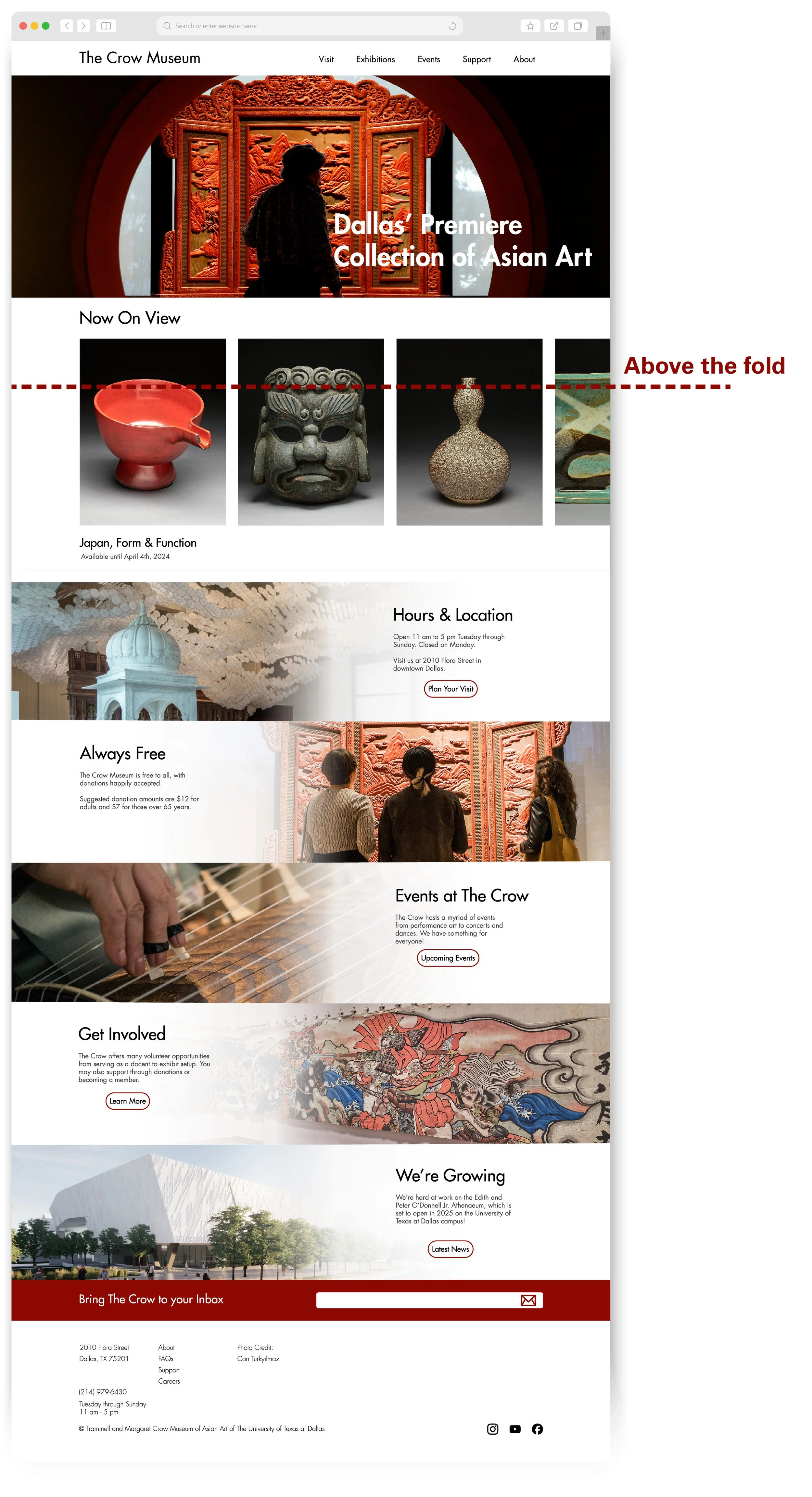
The final redesign addresses the design and layout issues of the original page and solves the key user problems identified during the research stage.
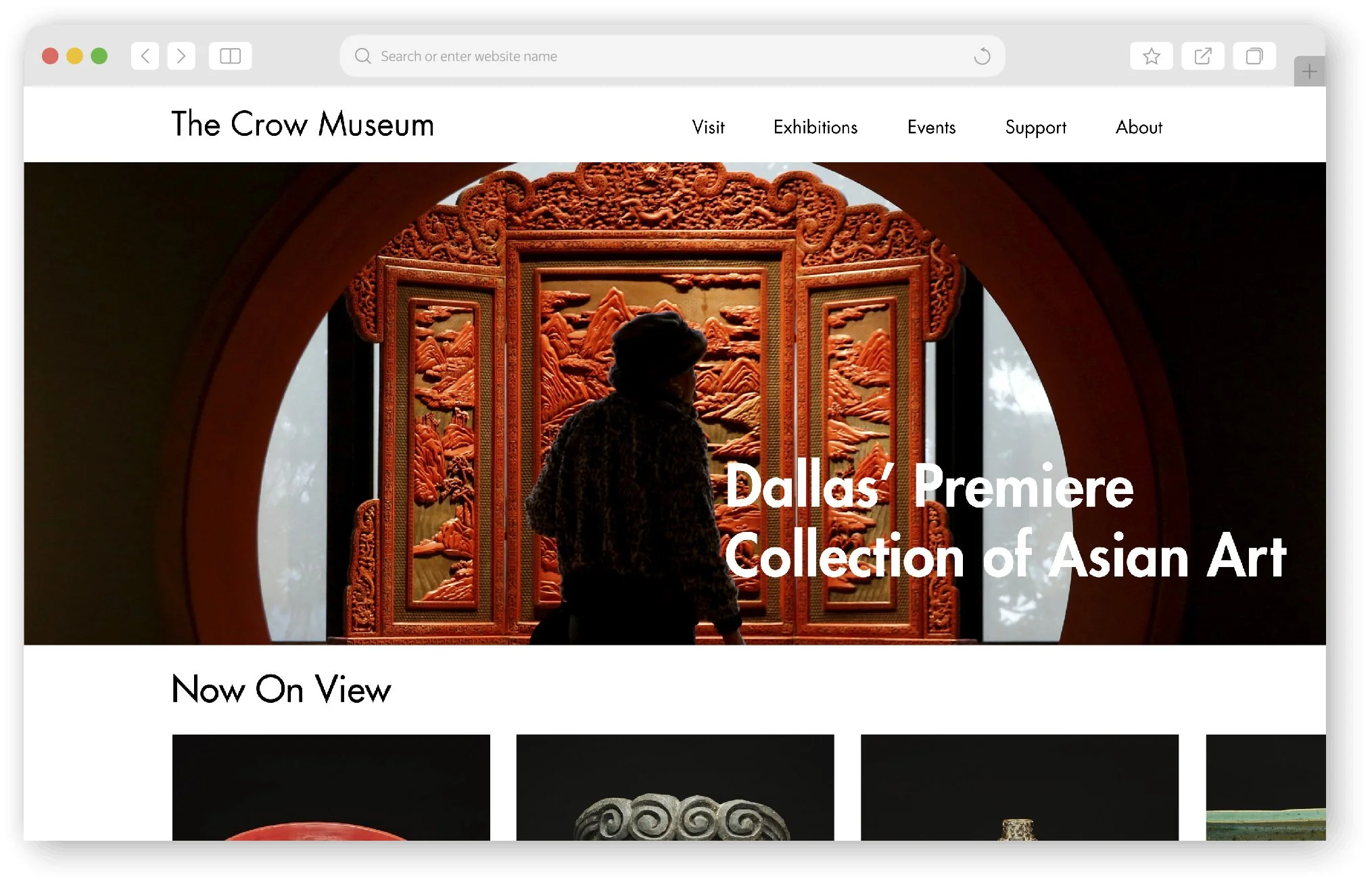
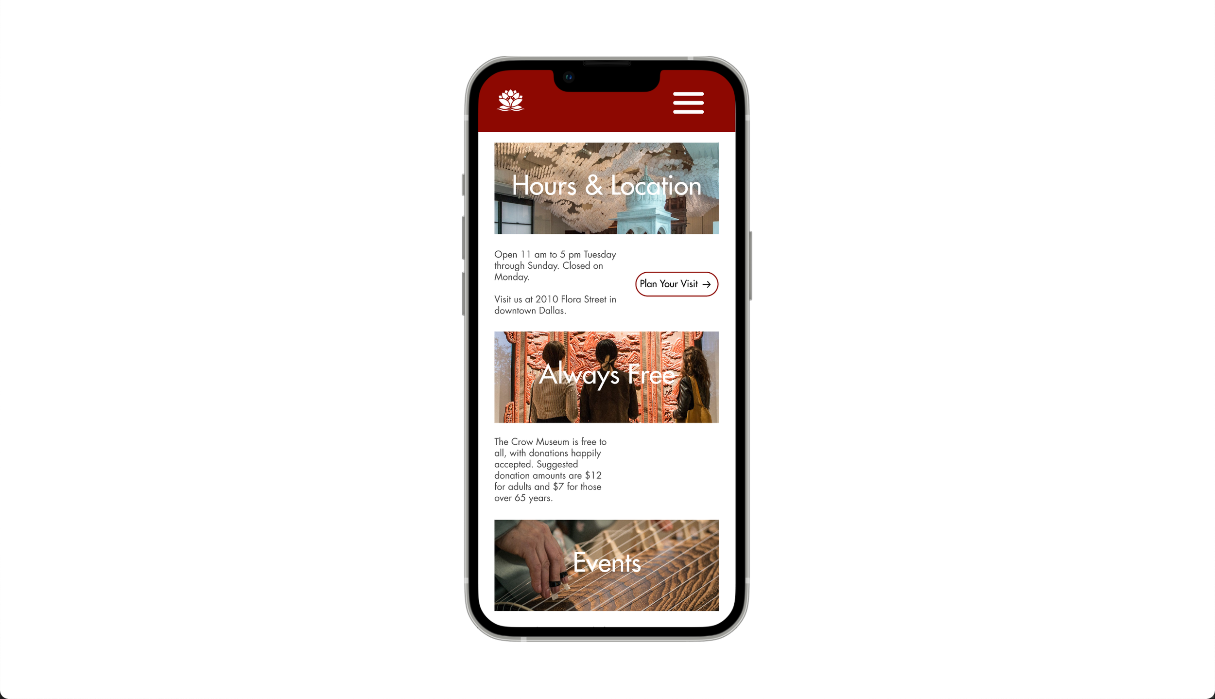
I used a hero image of the Crow’s iconic portal door along with a blurb about the museum. I wanted users to immediately understand what the Crow Museum was all about.
Below, I hinted at ongoing exhibitions to queue users to scroll down and explore more. This was a top priority, as it addressed one of our three key user problems: “What’s on display at the museum?”.
This section also solves the image hierarchy issues present on the original page. I gave the art on view the same dimensions inside the scrolling gallery to give a sense of unity.
In the section below, I dealt with the second user problem: “How do I plan my visit?”. The museum hours are stated concisely along with the address. I included a button to take the user to another page for more detailed information about planning their visit. This information is important, but it doesn’t belong on the homepage and deserves a dedicated area for itself.
Free admission is a unique aspect of the Crow and I wanted to highlight it with its own mini-section. This is information that people planning their visit would want to know, therefore it’s right underneath the Hours & Location section.
The end of the website addresses the third user problem of “How can I get involved?”. For visitors looking for in-depth involvement like volunteering, there is a ‘Learn More’ button. Some visitors might want a more passive involvement, so I also included a newsletter signup.
Finally, the existing design was not optimized for mobile devices making it difficult for mobile users to access information about the museum. I addressed this in my redesign to ensure access for all users regardless of their computing device. I’m particularly proud of the hamburger menu that opens up across the entire page for easy navigation.


Conclusion & Takeaways
Our project ended here but in an ideal world, I would’ve liked to measure the impact of the redesign.
I would have liked to see if there would be an uptick in website traffic or how long users stayed on the homepage compared to the original design. Running an A/B test to see the click-through and bounce rate of the two website versions could have been interesting. We could have also measured the number of visitors before and after the redesign.
Overall, I enjoyed working on this project. It encouraged me to think and design with the user in mind. Having goals in mind via the key user problems gave the redesign direction and kept me on track. Plus, working in a team was awesome! I loved being able to bounce ideas off each other and having different perspectives was key to creating a well-rounded understanding of the problems we were trying to solve.